Charts of the Week
Every issue of The Penn Wealth Report has a section called The Week in Charts. Graphs and charts can be excellent visual tools for getting a grasp on the overall conditions in an industry, a sector, a country, or a region. Select the box to the right of any row to be taken to the highlighted graphs.
Pull chart from the week:
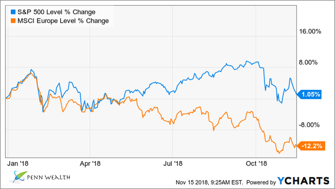
Think it's been a rough year in the US markets? Take a look at Europe.
|
Europe
Sectors Oil |
Things are getting ugly in Europe. Just look at the European stock markets.
Sector Hi-Lo: the best- and the worst-performing sectors YTD. Oil may be falling, but natural gas is taking an unwarranted spike up. |
|
Retail
Booze Oil |
An iconic 126-year-old retailer's end is near.
A 96% divergence between Budweiser and US beer maker Sam Adams. The price of oil keeps falling. |
|
Trade
Gold/Dollar KSU |
Hurt by stalled trade talks?
Gold falls, dollar strengthens. Viva la Mexican trade deal. |
|
Commodities
Trading Housing |
Soybeans the new king crop.
Trading vs Investing. Why are housing sales sluggish? |
|
Oil
GM Rates |
Oil's great resurgence.
Does leadership matter? Rate worries spook market. |
|
CMG
F, GM Crude |
Chipotle plummets.
Ford, GM divergence. US crude production hits new high. |

